Showing posts with label embossing. Show all posts

Sunday, September 14, 2008

A New Design Unfolds

While vacationing in Chicago last month with my mom (www.studiobeecreations.blogspot.com/), we stopped in the first ever Paper Source location. They were having a fantastic sale on lots of goodies including some summery paper colors. Included in the sale were sets of matchbook cards (A2 size). I bought a set of 25 just to get the measurements.

When I attempted to score the card in the correct dimensions, I was off by about 3/4". And not just the first time! By the time I figured it out, I had four cards with an extra score near the bottom fold. So, I covered the score mark on the inside of the card with a piece of ribbon which I also used to tie through as a bow on the top of the card.

Then, I needed to cover the score mark from the outside. I decided to incorporate a stamping element on the card. And I love heat embossing. So, starting with the "happy" cards, I pulled out the Stampin Up "Happy Everything" stamp set (pg. 143 of the 2008 catalog). These are posted for sale on etsy.


The "smile be happy" card uses the Quickutz Sophisticate set. I cut out the large letters using the Quick Stamps foam to stamp and emboss in copper the "smile". Then I used the smaller gel stamps from the set for the "be happy" pop up piece. On another card, I stamped out "time to smile".

"Best" is also cut from QK dies - can't remember now which font. But it looks like Biography. I stamped using craft ink and then heat embossed using clear. Once I get it posted, you'll be able to see the detail. For "Best Dad" I used the QK Silhouette to cut out the grill. But since I found the white core of the paper I used too distracting, I used a coordinating Stampin Up ink marker to color the edges. I did the same with a graduation cap for the matching "Best Grad" card.

It has been about 2 weeks since my last blog entry OR my last etsy post. I have been working on a creative project for work. Hopefully I will be able to share that story by this weekend.

Thank you for visiting. On your way out, check out my sister's blog at http://joy-full-ness.blogspot.com/.

Monday, September 8, 2008

From the Road: Lesson Learned

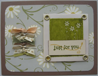
Keep all ribbon scraps!! These two cards both demonstrate this important lesson I've learned in my efforts at creating on the road. Especially this "just for you" card. The row of little knots was the perfect accent.


The negative image (from the In Any Event Stampin Up set) is stamped on vellum using classic ink from Stampin Up. The watercolor effect was unintended, but I will use it again. Unfortunately, the "thanks" sentiment did not come out clearly enough to be read. So, I covered it with a lovely piece of textured cardstock edged in brown ink and stamped using the Quickutz Sophisticate set. Finally, the vellum is attached to the same creamy cardstock with large brushed gold eyelets.


With this card I was going for understated. The paper itself is busy enough without accenting it too much. I began with the brown center - a scrap!! I knew I wanted to use the marigold yellow to tie it the paper's color theme (the back side of this double-sided paper is marigold yellow, too). But I also like to layer my paper pieces with ribbon. So I took a length each of gold and thinner brown-stitched ribbon and layered these in between the paper. The sentiment to "wish big" (from the Wish Big Stampin Up set) is stamped in pink. The white card stock is edged in the same. And, even though I was going for simple, I couldn't resist one more embellishment... the white cupcake (same set) heat embossed in the brown paper.


Check back in a couple of days to find out what the "flip flap" is all about.

Monday, April 28, 2008

Taking the Bee Line to Sweet

If you are looking at this blog entry, you may very well have buzzed over here from my mom's blog at http://studiobeecreations.blogspot.com. Her name is Debbie, and frankly I'm surprised she hasn't had it legally changed to Deb-bee.

I found this sweet polka dot bee paper at a scrapbook store I found after taking a wrong turn near Mahopac, NY - http://www.lastingmemoriesscrapbook.com/. I bought a few sheets for mom - which I still need to send to her.

Green is my favorite color - something I should probably be careful about or everything I make will be green. The base of the card is this great pale green generic, textured card stock. The white paper is textured Bazzil rounded off and distressed in green ink. I had used a Coluzzle to cut out the center and ink the inside edge. But, I didn't like the color I had chosen. On Saturday, I cut out the part I did not like - using the Coluzzle again. But then the hole was too big!

My mom had sent me months and months ago some awesome fabric and fiber paper. The yellowish, flowered center piece is cut (again, Coluzzle) from one of those pages to tie in the yellow from the bee with the rest of the card.

The sweet polka dot bee paper I cut to frame the center of the card and distressed the outside edge in brown. The green, stitched ribbon I tied into a bow before using a glue dot to keep it down. The Prima flowers are centered with color-coordinating Stickles.

I used a Stampin Up brass stencil to dry emboss the "Hello!", but didn't like the effect - too subtle. So, I used the same stencil on the front to stencil watermark ink and winter white Stampin Up embossing powder (two passes) to really make it pop from the page.


The bee is a QK double-die 2x2 image where the yellow paper is textured Bazzil. You can just detect the faint striping effect.

Tomorrow's post will show a one-hour scrapbook page I started and finished this weekend. And, oh, it's green. Oh well!

Thursday, April 17, 2008

Lost and Found - in Meriden

Someone left a comment on the ewe card (see blog entry below Have Travel Bag...) wanting to know where I found the ewe paper. I know I have several different animals, but this was what I found for this pic...

The company is The Paper Lady - and all the animals are just awesome!! I just looked at the site myself - never did before tonight. I am going to HAVE to buy some - shouldn't have any trouble meeting the minimum order requirement.

I put together a lobster-themed page together using this brand of paper (see company link below) for a Boston Globe cartoon caption contest Bill won awhile ago. Ooh! Another idea for a post!

Now, for the last card made in Meriden, CT...


This is a 6" x 6" card made from this great double-sided paper. The inside is green on slightly lighter green polka dots. I got lucky with my card stock scrap pieces that I had just the right colors to make the embellishments using the Quickutz squeeze - SO glad I did not sell or get rid of that tool - it's perfect for travelling! The letters I have from one small stamp set. The "I" is the only embossed letter - had to do it to get the white to pop from the paper.

Thank you for visiting my blog. I hope to see you around the blog-o-sphere soon. I look forward to visiting everyone's blog and getting to know your creative sides. If you visited from my mom's blog (http://studiobeecreations.blogspot.com), good luck with the Blog Candy!

Sunday, March 16, 2008

Reefilling those Creative Urges

It's not a misspelling. I meant to put that extra "e" in the "reefilling" both in the blog and on the card. A friend from work took me to an art supply store a couple of months ago knowing I am always looking for cool paper to craft with. The silver fiber paper I knew would be used as the basis for an underwater-themed creation. Of course, when we scrap our dive vacation to Aruba this summer, I will be using this paper again.

Talk about recycling/repurposing - I used the grey ribbon from an Ann Taylor bag - just about my favorite place to shop for clothes EVER - to give the card the chance to hang as art work in someone's home or office/cubicle.


I used the Stampin Up classy brass template to dry emboss the circles on the SU Blue Bayou card stock.

Quickutz Sophisticate clear stamp font was used for the phrase with SU Sterling Silver embossing powder.


The crab and fish were cut from QK dies and the scallop was cut from a QK Silhouette image.


The back half of the fish were heat embossed in two layers of color - purple and blue.


I decided to list this item on eBay instead of etsy to test the waters - so to speak! ;)

I am travelling again this week, but I still hope to do some on the road creating. I love Marriott Residence Inn for being able to spread out - just like at home!

Happy St. Patty's Day!

Thursday, March 6, 2008

On the Road

My job takes me away from home periodically. It's a good month when I have fewer than 5 days of travel. A great month when I don't travel at all! The last time that happened was November '07. I am crossing my fingers for a good month in April.

This week, I was in Fishkill, NY, for 3 nights. Knowing I would be in one place for sequential nights, I brought some cardmaking supplies with me on this trip and made 5 cards last night.
Woo hoo!!
For this first one, I was inspired by the gears Quickutz die sitting in the binder having yet to be used. It just so happened, too, that I had a 3"x3" silver cardstock leftover piece in my bag 'o goodies to cut out the gears. Yeah me!
I stamped the background with a Stampin' Up background image. The coordinating-color circles are also QK dies, stamped on using the QK Sophisticate stamp set and heat embossed using SU powders. The ribbon finished the card off nicely, I think.


This awesome double-sided cardstock was just begging to be made into a card. It was the scraps I had available and, again, the QK Sophisticate stamp set that inspired the theme of the card. I used copper archival ink and clear heat embossing powder for the phrase. The prima flowers and pewter stickles set it off just right.


Do the scissors look familiar. I used a scrap piece from the card directly above to cut these scissors from a QK die. These trips from home actually force me to use the scraps I am reluctant to use at home. I took larger scrap pieces from other projects and tilted them until they each touched the edges of the larger layer behind. The vellum piece is held onto the orange polka dot piece with copper-color brads.

The same copper-colored paper used as a layer in the card above is used here again for the two phrase pieces. The font? What else but QK Sophisticate?!

The butterfly is a SU image from a whimsy-named stamp set and heat embossed in brown. The top wings on the butterfly are popped up from the card. The ribbon is knotted and threaded underneath the butterfly. I just love the knotting look to the ribbon. I have used this with the scissors on two scrapbook-themed pages I've created. (Perhaps I should post those some day.)


From a clear stamp set a bought ages ago, I used VersaMark to stamp this little butterfly - oh so subtle - on the two phrase pieces.

I purposely brought these two SU stamp sets to create this card I have been creating in my head for some time. The green paper has this great texture - looks like grass. I found it as this great art supply store someone introduced me to in West Hartford, CT.


Finally, I used the "thanks" card template from the previous posting to create this more colorful version. A couple of differences: I used Prima flowers and stickles instead of a ribbon and the border across the bottom was replaced with QK flourish stamp images.


I actually feel fairly accomplished with these creations. The irony is, though, that with all the travelling this week, I will probably be too tired to create anything this weekend.

I am still working on the next music and scrapbook page posting. Until then, you should definitely check out my mom's new creations posted on etsy!!

http://www.etsy.com/view_listing.php?listing_id=10008686

Until then, take care and happy creating!

Sunday, February 24, 2008

Music and Scrapbook Pages - Part 13 - Pops on Bernstein

This page I made shortly after receiving the most excellent corner rounder from Creative Memories. All of the sudden I found that just about everything should have rounded corners!!


The off-set pictures of the top-billed performers I clipped from the 2nd program will always get at these events. I used very low pop dots for the pics. I wanted to color up the embellishments on this page, so I chose the green card stock for the narrative piece. The font is actually my handwriting made into a font - a birthday gift from my husband so I could "write" in any color and any font size. Very cool!

I also used green distressing ink on the Boston Pops logo piece and the program sheets to tie in the green.

To sparkle it up, I placed small dots of stickles on the program pages. Bernstein's name is spelled out in these really cool stickers - I actually broke down and used some alphabet letters - a huge step for me!


The music note is stamped and embossed in black. The rest of the performers pics - also from the program - are laid out in no particular order, but in more even spaces rather than scattered.

Bill's talents return for the next posting for a page on a more intimate musical performance.

Wednesday, January 30, 2008

Music and Scrapbook Pages - Part 3 - Seasons of Love


The last post pretty much closed 2003 for us - our 1st year living in Boston. So, when my mom comes to visit, I take her to NYC to see RENT!! She surprised me with the letters - the page just wouldn't be the same without them.

Since we were keeping the playbill and event brochures for everything - HINT: USUALLY CONTAIN EXCELLENT EMBELLISHMENTS!! - I had to have a way to keep the material on the page without ruining it. I found these large-size photo corners. I recently ran out and can only find jumbo photo corners. But, aren't they great?!


There is quite a bit to show you on this page. I think I first used ink embossing here - and all three colors I had - I used a great big staff music stamp and overlapped silver, pewter, and gold embossing, then proceeded to create the page. I also used theatre-themed stickers and Quickutz music notes - oh - and pop dots on the music note!


You may also notice the red square in the bottom left corner - that's the narrative for this page. Just some details about the event and other tidbits. It's another thing we try to do for each page. A fun way to remember little details.

The next page will be "better than chocolate".