Sunday, August 24, 2014

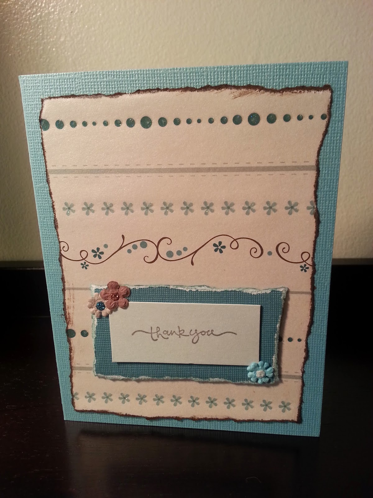
Thank you in Blue

I begin the process of making a card or set of cards for someone by asking for their favorite colors.  This set was inspired by Benjamin Moore paint colors which reminded them of time spent strolling along the ocean: catalina blue and kittery point green.  I was best able to match the bluest of the two hues.

There are three "thank you" cards, two "best wishes", and one "wish big" card to cover a variety of situations.


This was my first time EVER using buttons.  Bill and I were both pleasantly surprised by the results.


Often, the paper design dictates placement.  In this card, the "thank you" sentiment is placed lower than the "best wishes" pair (below).  The swirl just had to be preserved.


Friday, October 11, 2013

Can't Help Falling in Love

As a federal employee on furlough, I am finding myself with A LOT of extra time.  I wandered onto the Silhouette blog and today stumbled onto their weekly challenge.  I made this card a couple of days ago, and it fits perfectly with their theme for fall seasonal projects.  I love the color combinations AND the polka dot raised paper I used for the leaves.  It may just be my new obsession!


Sunday, June 9, 2013

Tag, You're It!

I have some great items in the final stages of production.  Meanwhile, what to do with all those scraps from other projects?  Tags, of course!


These new items are posted in my etsy store.  Check them out and be sure to come back in a few days for the next stage in the development of our scrapbook page frames.

Sunday, June 2, 2013

Jumping back in

Goodness!  It's been a whole year since my last post!  Since then I have sold a couple of custom items on etsy, moved again (still in MD), my husband is now working for the Maryland Science Center designing and building exhibits once again, our cats are officially diagnosed as crazy and on generic prozac, and an opportunity to sell our items in a brick and mortar store fell through due to lack of vendor interest.

It's this last experience that has given a jump start to our creativity and an opportunity to collaborate on some really awesome pieces.  My husband is truly talented as an exhibit designer.  But he also has some awesome ideas for frames that highlight the beauty of the frameable scrapbook pages and cards I've been making.

This great frame has raised corners.  It holds a 12" x 12" page.


The pieces of this simple-looking frame are attached with dowels rather than nails.


Both of these are posted on etsy with more designs coming over the next few days.

Monday, May 28, 2012

Natotela

A friend of mine just graduated from nursing school.  Born and raised in Zambia, she became a U.S. citizen this last December.  At her graduation party, I knew there would be others from Zambia presenting her with gifts.  I wanted to give her something special to honor her accomplishment and heritage.

A set of "thank you" cards seemed natural enough.  But, why not incorporate the language of her home, too?  Natotela is Zambian for "thank you". 


You may also recognize another theme to this set...  Pink!  Her favorite colors are pink and red.  So, I picked out some of the best paper and color combinations and paired the pinks and reds with brown and light olive green. 


I picked out different fonts for the lettering of "natotela" and "thank you".  I used the Silhouette to merge the letters and created the offset shadows.  When it seemed appropriate, I used the same paper for the letters on different cards where the base and top sheet were also different. 

The top piece is chosen to coordinate with the base, then torn at an angle and the exposed edge inked in matching ink.


I will be using this design again.  Would be great to include other languages, too. 

Natotela sa na.  Thank you so much for looking at my site!

On the road again...

Back in June 2008, I made a special order graduation card for an 8th grade girl with a VW bus theme.  Someone saw that listing on my etsy site, and wanted me to make one for her daughter's high school graduation this year. 


She loves the peace and flower symbols.  And while her favorite color is red, I also wanted to incorporate her HS colors of green and blue. 


I used some pop ups to add depth and dimension to the layers of the card.  I also had the perfect prima flowers and stickles to complete the image. 

I just love a stroll down memory lane!


Sunday, January 29, 2012

Frameable Scrapbook Pages

I finally broke through with another frameable scrapbook page. This one I just listed on etsy.com.
After completing the gift for a couple of friends (http://kittykards.blogspot.com/2012/01/celebrating-christmas-union.html), I knew I had to do more of these. They can be customized with select words or sentiments for whatever the occassion. I am thrilled with how this turned out and can't wait to make more. Once I find the inspiration for the starburst design, I will link it here.
The "Sisters Forever" can be for family or for sorority sisters.
"For Mom" can be special for Mother's Day or even Mom's birthday. I chose the Postcard font from a Silhouette portfolio.
I love using clear photo corners for this type of project. The photos seem to float on the pages.
More color combos to come!